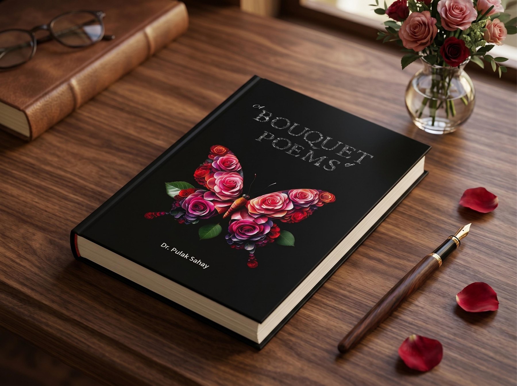
editorial
Divyangani Sharma / New Delhi
Systems designed to hold across identity, communication and experience — built to evolve and scale across editions.
Eight years. Work across Expo 2020 Dubai, WEF Davos,
Hannover Messe, WHO, CII, Incredible India, Amara Raja, MCM, Govt.
About Divyangani
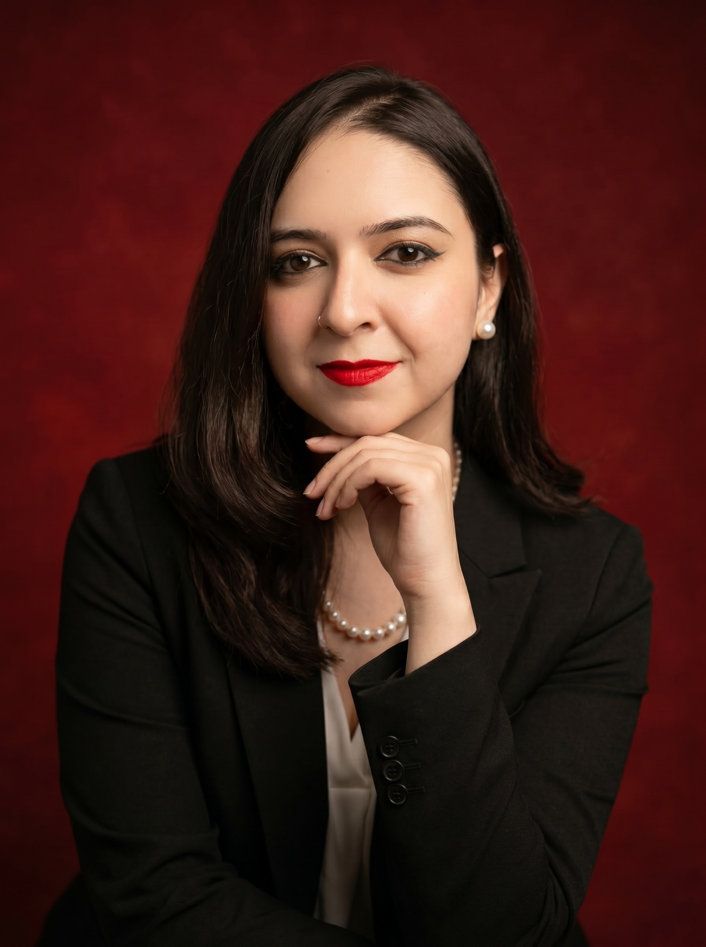
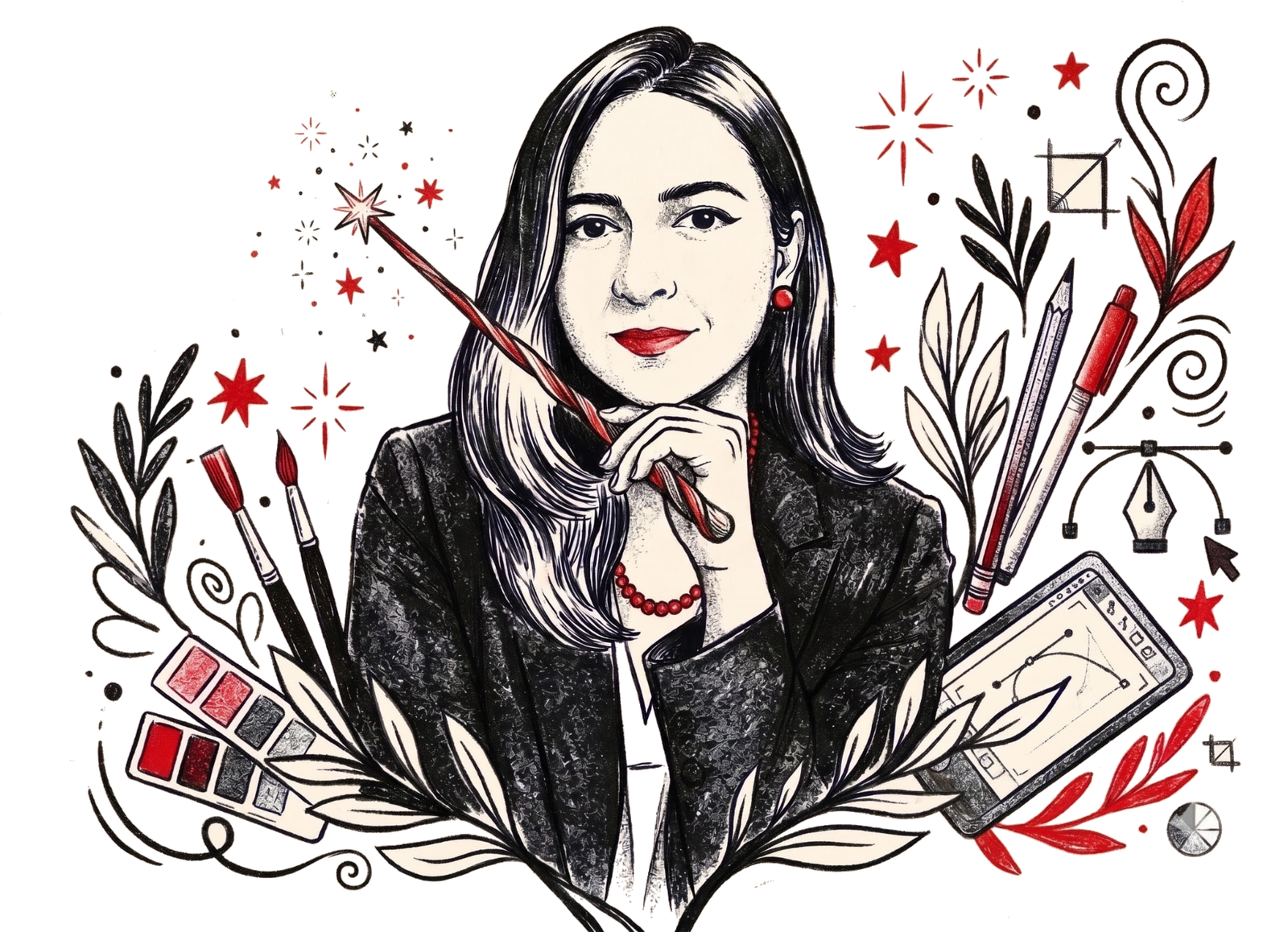
Creative and Art Director with 8+ years of enriching experience in building brand, pavilion and campaign systems across continents. Conceptualised and designed client-focussed innovative creatives for India pavilions at WEF Davos, Hannover Messe and Expo 2020 Dubai; delivered national campaigns for Incredible India. Designed campaigns from inception to implementation to delivery; converted and developed abstract brand ideas into clean, editorial designs across print and digital platforms. International exposure and studies have enriched my global outlook and perspective, imparting cultural awareness and focus on place branding, including a drive for illustrations and storytelling.
Years / design practice
Continents / projects across
Vehicle wraps / metro, bus & car
Years / WEF Davos + Hannover Messe
Design / art enthusiast
EXPERTISE
Research, positioning, identity, visual language, guidelines and brand rollout — building systems designed to work beyond the logo.
Concept development, visual direction, typography, image-making, OOH, social and integrated campaigns — from the first idea to final execution.
Pavilions, exhibitions, stages, environmental graphics, building wraps, metro, bus and vehicle wraps, wayfinding and large-format applications — translating visual systems into physical environments.
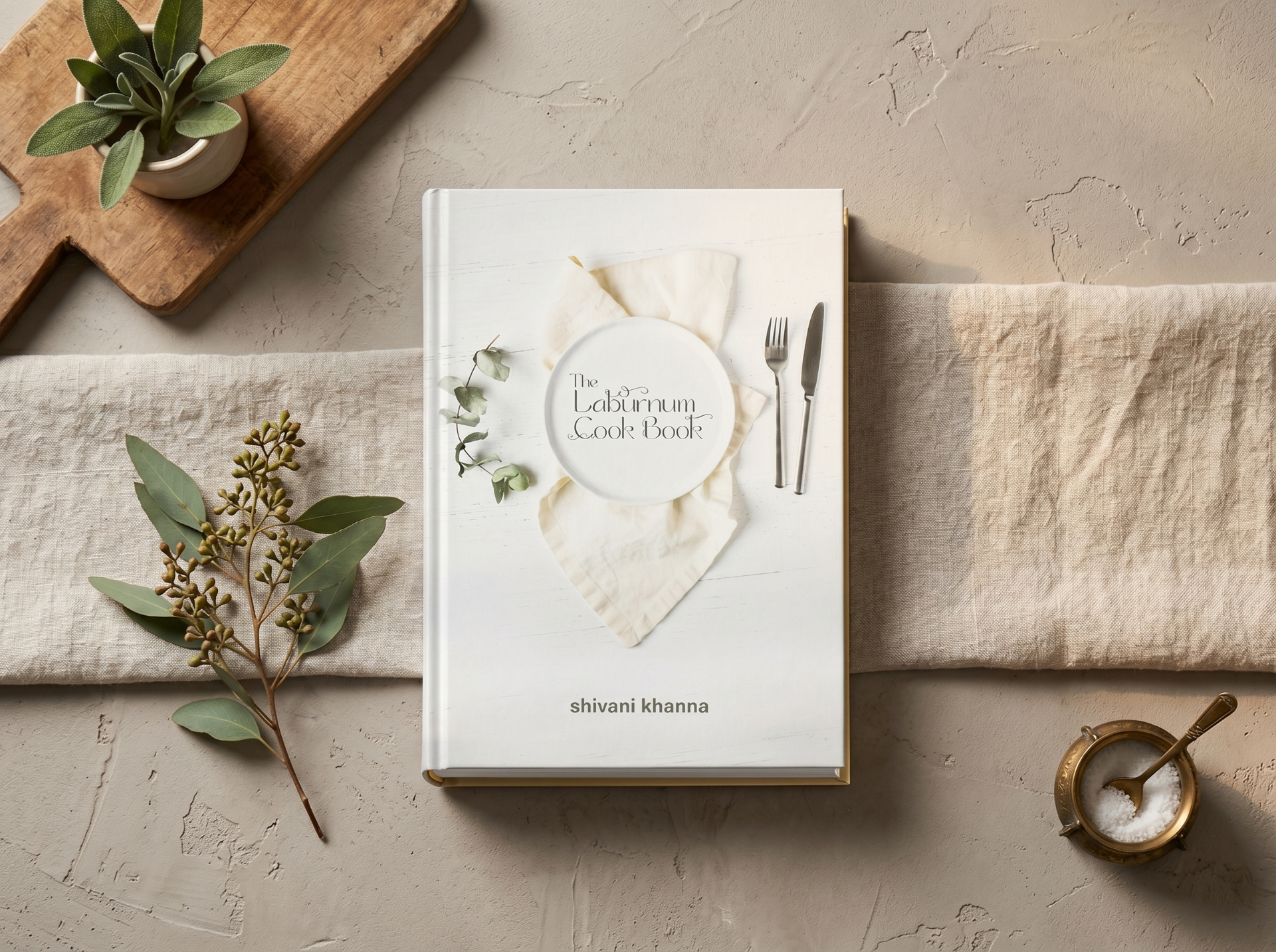
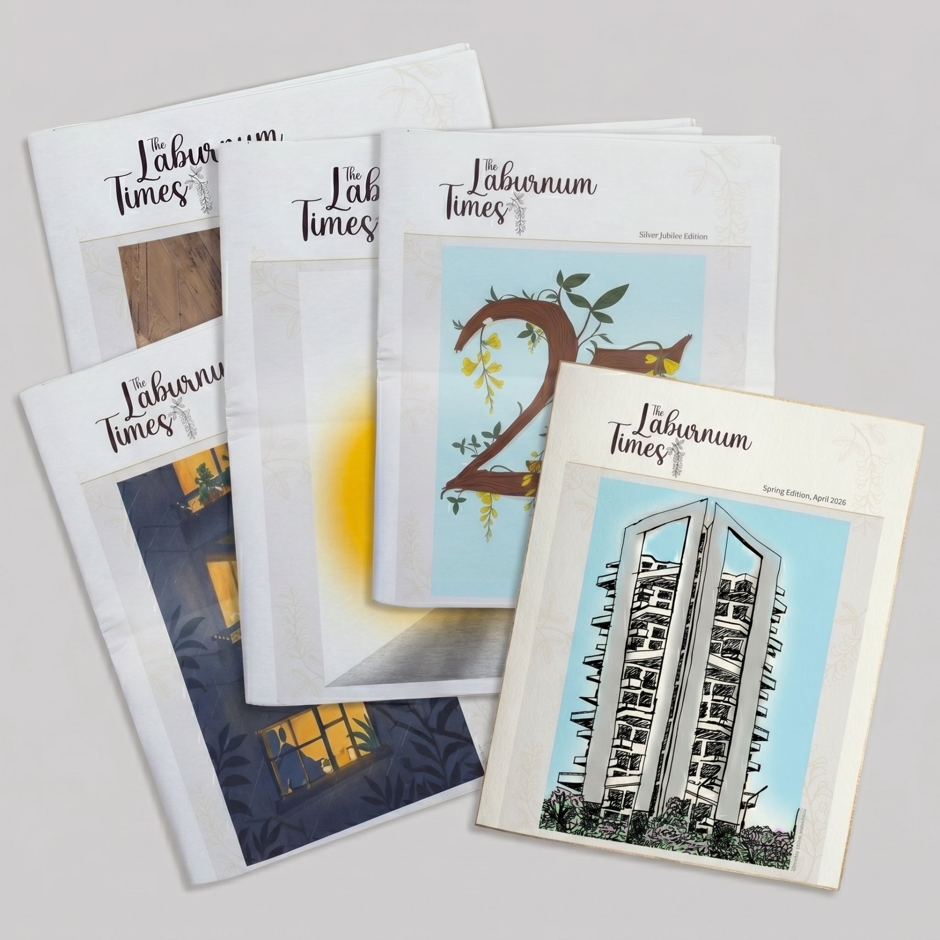
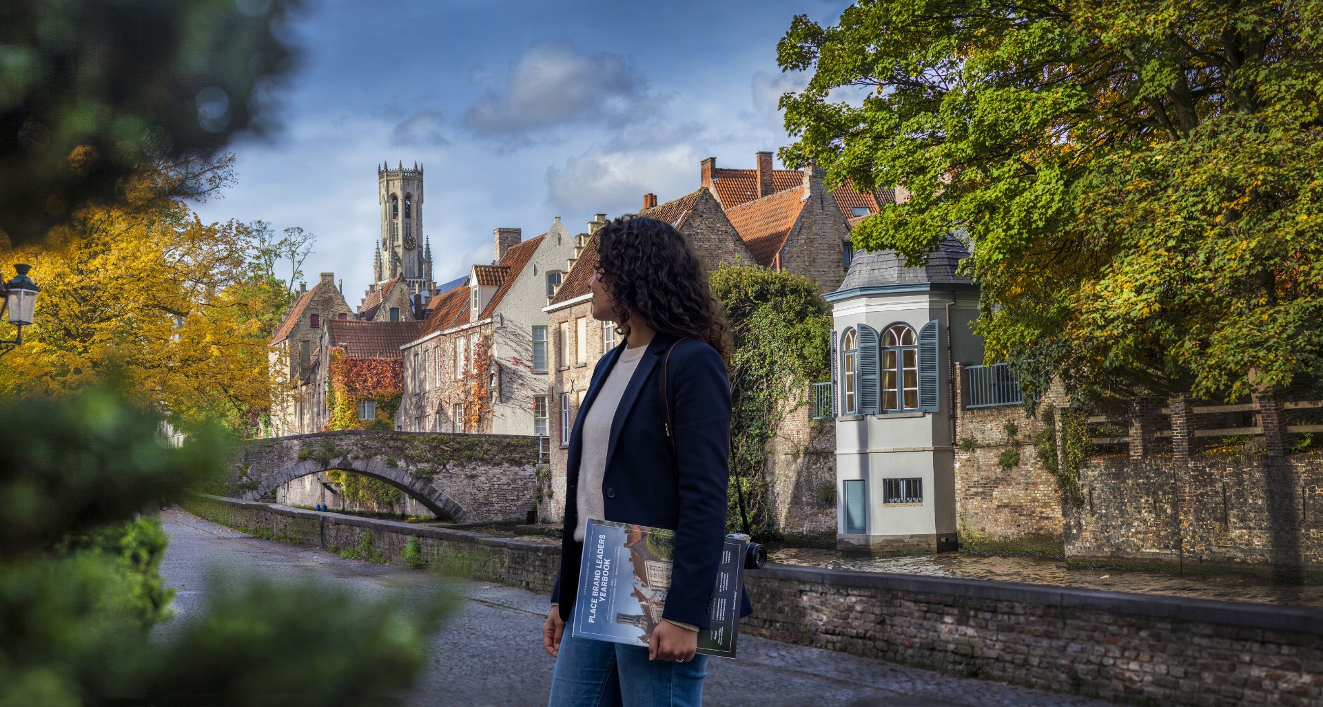
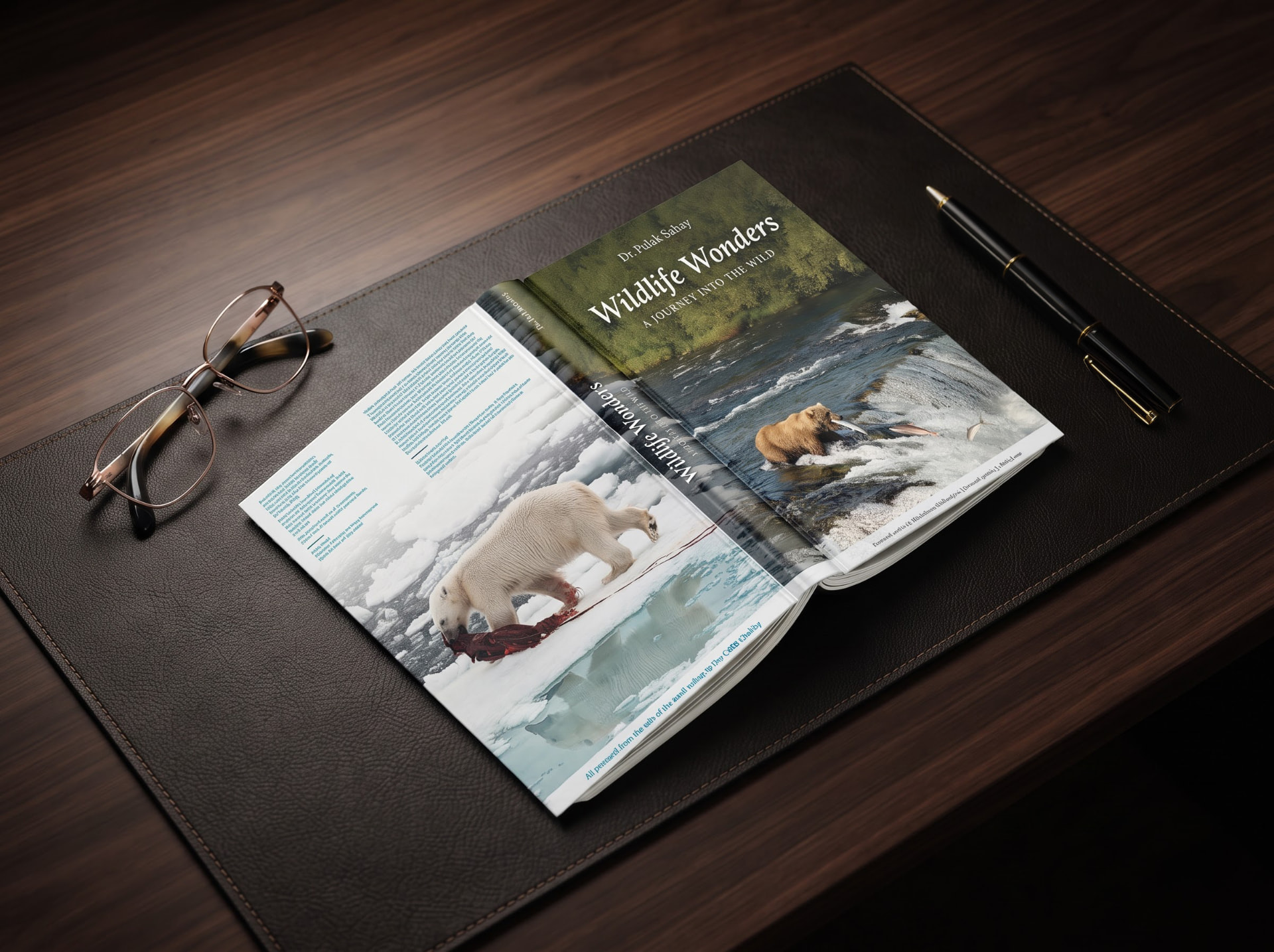
Books, magazines, coffee-table publications and editorial systems — combining structure, typography and visual storytelling.
Digital and hand illustration, visual studies, iconography and image-making used as tools for storytelling, concept development and visual problem-solving.
Packaging, retail touchpoints and visual systems across fashion, hospitality, health, luxury and emerging brands.
Selected work
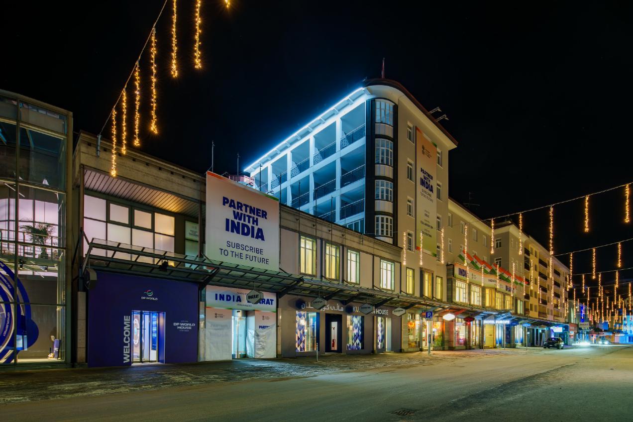
WEF Davos — Where Indian states and institutions compete for investor attention on the world's most scrutinized economic stage. A multi-scale nation branding exercise. At the largest scale, the Government of India 2026 Europe Hotel takeover — a 10,000 sq ft, heritage-style pavilion housing 10 Indian states under one unified architecture. A system designed to hold a single national identity without flattening individual state stories across manufacturing, technology, sustainability and innovation. Alongside it, environmental graphics and spatial storytelling for the CII Pavilion 2026 translating India's innovation narrative into immersive space, including the WeLead Lounge — a dedicated women's leadership space launched by CII in partnership with the Ministry of Women & Child Development and the Bill & Melinda Gates Foundation. Designed as a distinct identity within the larger India narrative, it created a platform for dialogue and visibility around women-led development. Completing the platform, distinct pavilion identities and billboards for Guidance Tamil Nadu (2022-24) and the Economic Development Board, Andhra Pradesh (2022, 2024) — giving each state a competitive, differentiated voice on the same street. Together, the work gave India multiple coherent presences on one platform, from nation to state, in the Swiss snow.
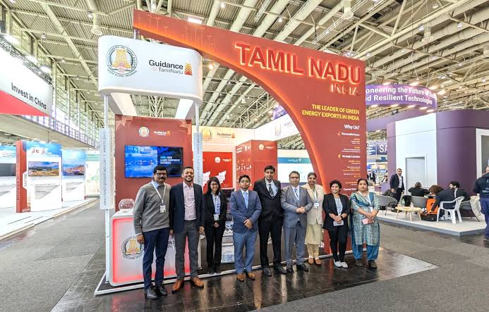
GUIDANCE TAMIL NADU, 2022-23 Hannover Messe — Guidance Tamil Nadu's investment story extended to one of the world's largest industrial trade fairs. Building on the identity established at Davos, the work carried Tamil Nadu's global presence forward into a new register, giving the state a consistent, recognizable face from Switzerland to Germany.
INDIA PAVILION AT DUBAI — Expo 2020 Dubai was a global stage where the India Pavilion emerged as one of the most visited and celebrated experiences. Despite delays, a carefully curated blend of culture, innovation, and engagement shaped a dynamic space — from immersive displays to seminars and business forums — reflecting the power of creativity and collaboration at scale.
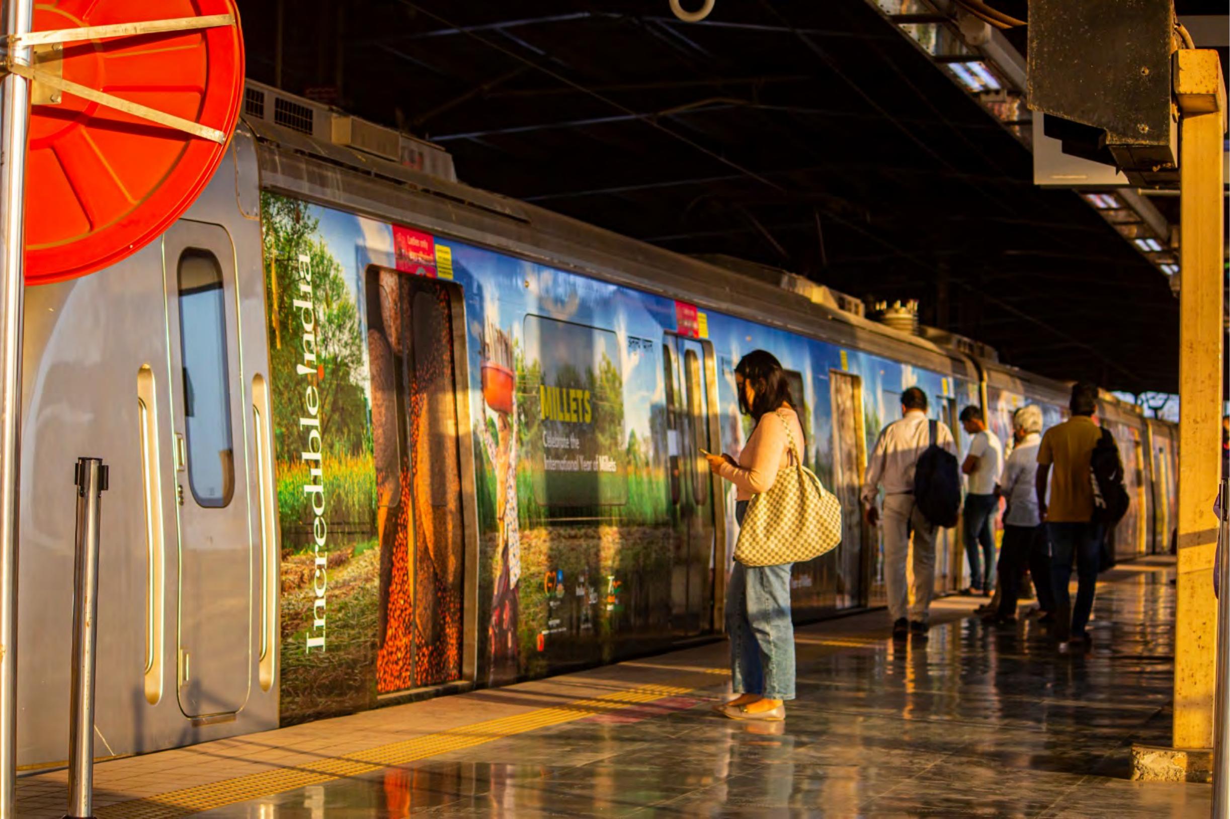
MUMBAI METRO WRAP + CAMPAIGN — Incredible India's tourism story moved off the page and onto the platform — reimagined as a full metro wrap across Mumbai. Beyond the wrap itself, the campaign work spanned the breadth of the country's appeal: the millets campaign positioning India's ancient grain as a global superfood story, wildlife sanctuaries, forts and palaces, and the culture and festivals that define the tourist imagination of India. The work translated all of it into a hundred-metre canvas, turning daily transit into a moving advertisement for the country's diversity.

ePOSITIVE LOGO, e+ LABS BRANDING & BUS WRAP — As one of India's largest lead-acid battery manufacturers moved into EV territory, Amaron needed a sub-brand that could carry that shift. The work designed the logo for the energy branding and for e+ Labs, then extended the mark — logo, mnemonic and livery — onto a bus wrap that did double duty: showcasing clean energy to the public while serving as employee transportation. Positioning Amaron's shift into EV as forward motion, not pivot.
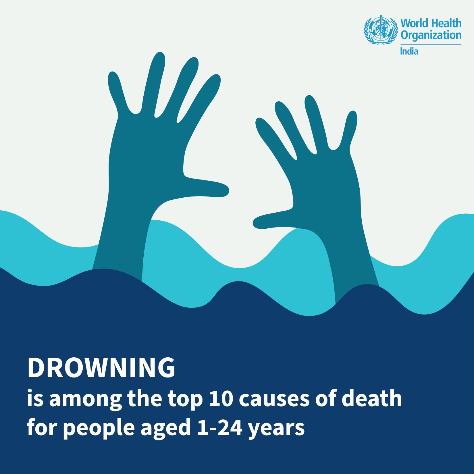
WHO, SOCIAL CAMPAIGNS + SOCIAL MEDIA — Public health communication lives or dies by attention. WHO needed a social presence that could hold authority and reach at once — the work developed a refreshed campaign design system, driving measurable growth in engagement without diluting the gravity of the message.
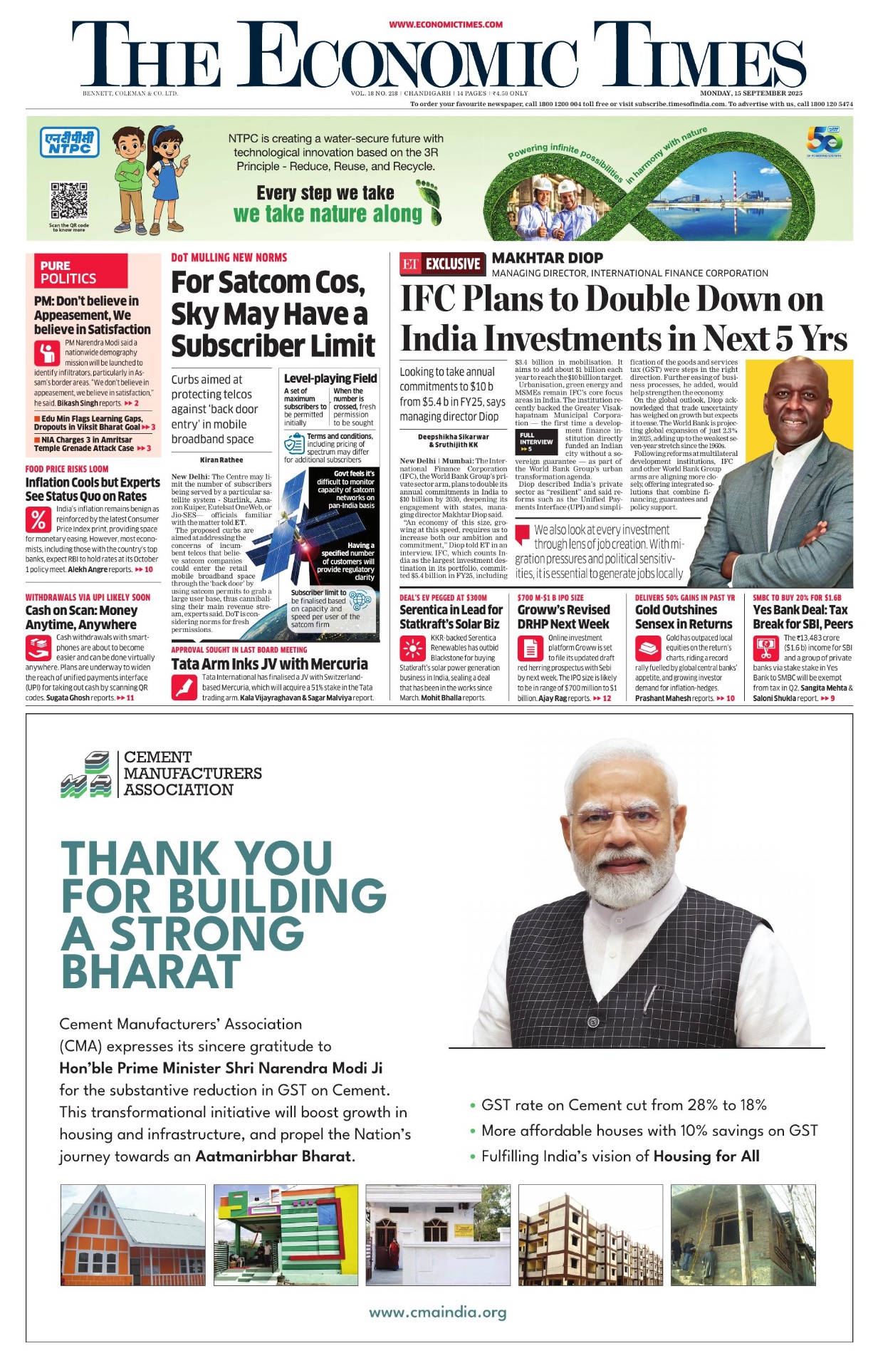
CMA, ECONOMIC TIMES NATIONAL CAMPAIGN — When India's cement sector needed to announce GST reform to the nation, the message had to carry both policy weight and public trust. The work designed a national newspaper campaign — featuring Narendra Modi Ji — pairing clear information with strong visual storytelling for single-day national impact.

ISB INSIGHTS FORUM, SUMMIT IDENTITY — A new forum had to arrive fully formed, with no legacy to lean on. The work built ISB Insights Forum's identity from the ground up — logo, branding and communication design — for its inaugural session.
TAMIL NADU TECH SUMMIT, IDENTITY & CAMPAIGN — Umagine Chennai set out to be Asia's answer to global tech summits — which meant its visual language had to compete on the same stage as the ones it was chasing. The work developed the full creative system: identity, campaign assets and brand guidelines for a first edition with global ambitions.
iTNT BRAND IDENTITY — India's first Emerging and DeepTech Innovation Network needed a mark as forward as its mandate. The logo distills iTNT Hub's identity into a single symbol built to travel across pavilion, deck and digital.
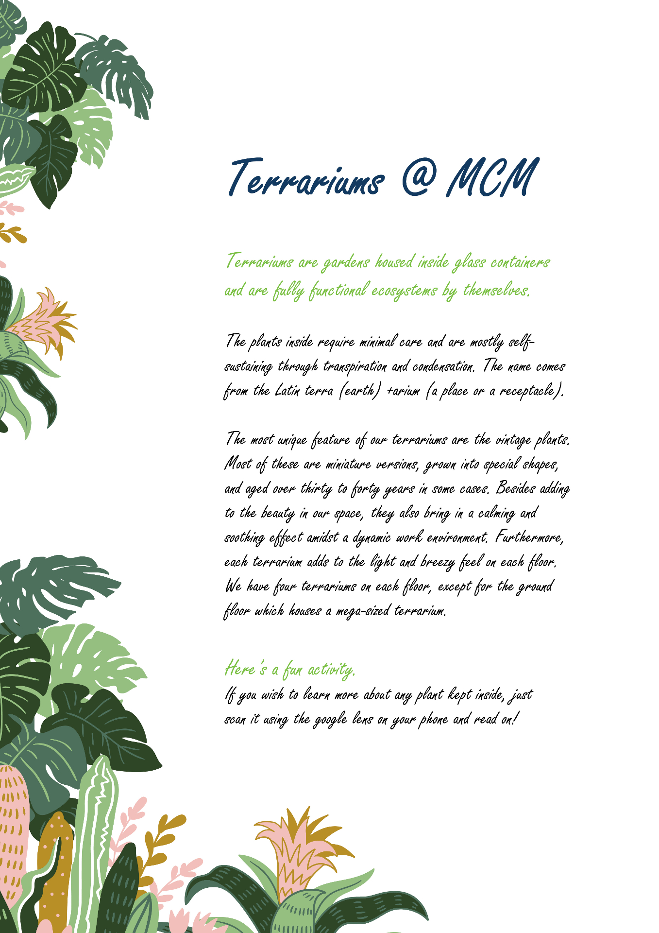
MCM, ANNUAL SUMMIT IDENTITY + WORKPLACE GRAPHICS SYSTEM + INTERNAL COMMS — Each MCM summit needed its own mark to anchor the year's theme. The work designed the logo for MCM's yearly summits — the identity that every other piece of summit collateral was built around. Separately, a globally awarded workplace needed its culture to show up in its space, not just its policies. The work transformed office environments with posters, brochures, wall graphics and a corporate story built for reception screens — turning internal comms into physical brand experience.
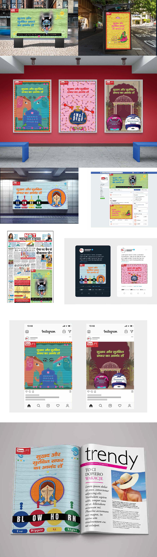
ROAD SAFETY, NATIONAL CAMPAIGN & 18 YEARS OF SLF MAGAZINE — Road safety advocacy has to move policy and behaviour at once — a slower, harder brief than most campaigns. The work designed nationwide communication for SaveLIFE Foundation, sitting at the intersection of policy, design and on-ground action in Uttar Pradesh. Alongside the campaign, a magazine was designed charting the organisation's 18-year journey and its measurable impact on road fatalities and safety — turning years of advocacy work into a single, tangible record.
More to explore
Go beyond the selected projects. Explore expanded systems, editorial work, campaigns and visual studies across the Gallery.
An extended view of projects, explorations and identities beyond the curated selection.
Visit Archive ↗Self-initiated explorations across branding, campaigns and illustration.
Visit Personal Practice ↗Projects
editorial
editorial
editorial
editorial
editorial
editorial
editorial
editorial
Process
Every project starts with clarity: mapping context, stakeholders, and what needs to hold beyond a single asset. I listen, ask the right questions, and define the real problem before moving forward.
Insight becomes structure: brand architecture, visual language, editorial and spatial systems built to be used, not admired. Direction is tested and refined until the idea has real form.
The system rolls out across pavilion, OOH, campaign and publication with guidelines, templates and handover so teams can ship without me, and the work holds year on year rather than expiring with the launch.
“Every project is a shared space.
I build the structure, so the room can meet in the middle.”— Divyangani
Write to Divyangani
I reply to every letter personally. Tell me a little about the project, the feeling you want it to hold, and when you'd like
to meet. For roles and collaborations, the same email works.
New Delhi, India