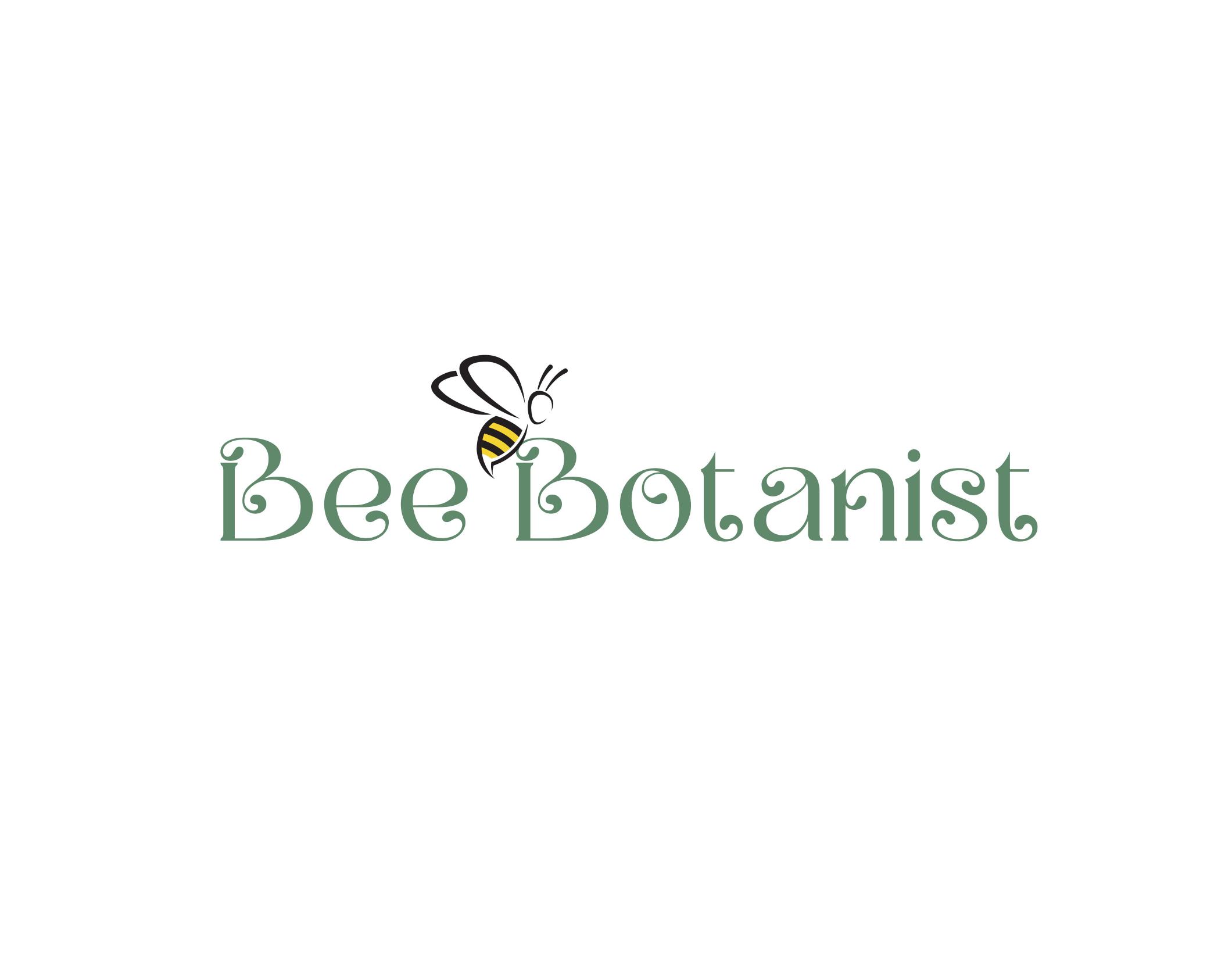
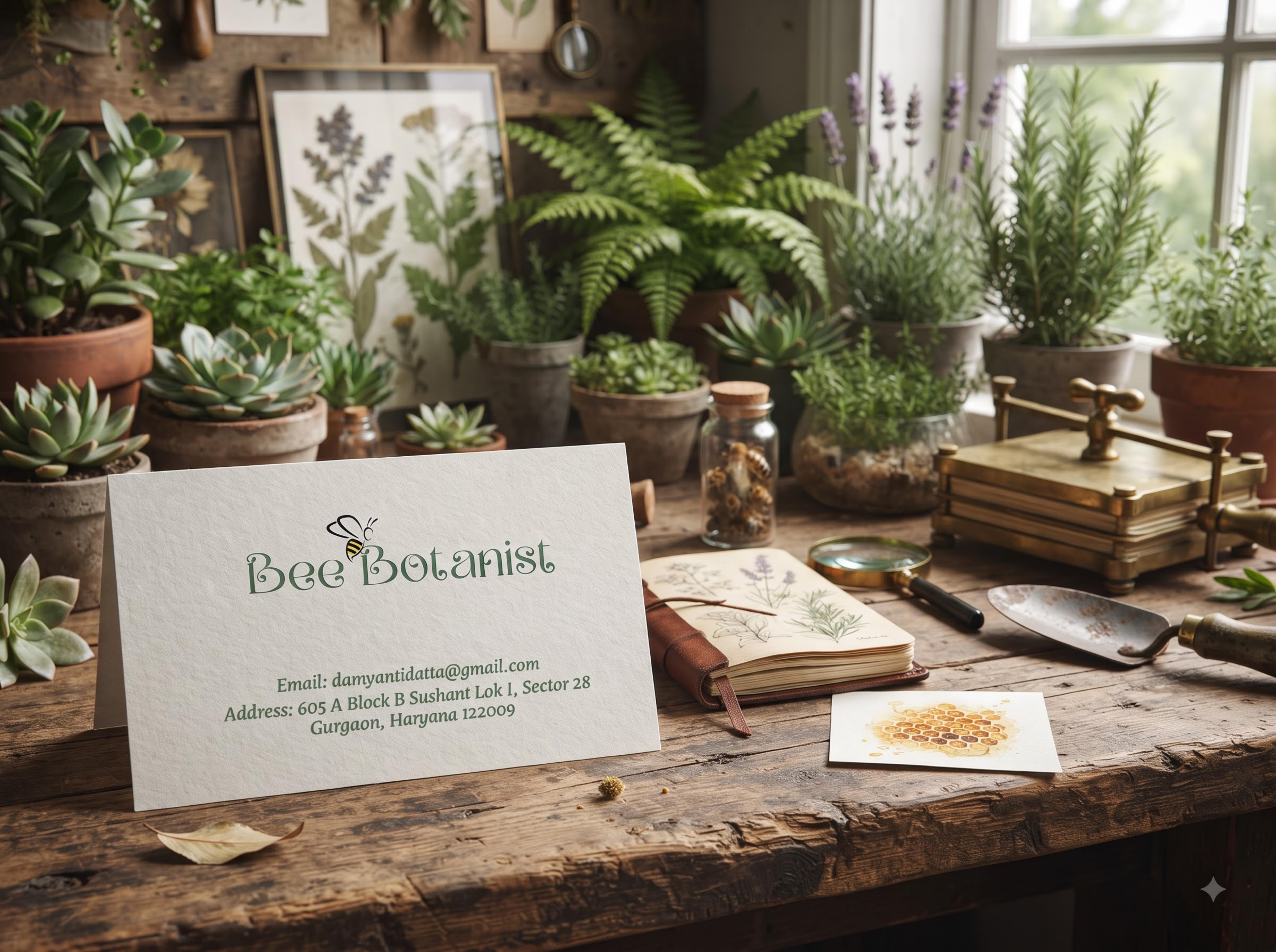
The Bee Botanist logo merges playfulness with purpose. A delicate bee illustration interacts with typography, creating a mark that feels alive and in motion. Letterforms are soft, organic and slightly ornamental, mirroring natural growth while maintaining clarity and charm.
Bee sits on the ascender of Botanist — not as icon beside, but as part of word. B letterforms are looped like vines, you nailed organic + ornamental. Grey on white is right, keep it — not black.